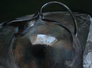
 Detail of work in progress
 Detail of work in progress, previous stage
I've also been struggling with the swatch of wax paper that runs behind the pitcher. The crinkles up in the right corner catch the light and jumps out quite a bit, but if I paint them with too much contrast they look a) too eye-catching and b) dumb. It's been a lot of push and pull to get it to this stage.
For some reason the bottom pedestal of the pitcher I worked on last week was a breeze in comparison to these areas, even with all that semi-transparent wax paper overlapping the pedestal.
All these photographs are reducing the color saturation compared to the actual painting. My paintings are of course very monochromatic, but I use a full range of hues to mix my neutral colors, and in person you can see a lot more range of hues within the values. For the final photo I'll work harder to get a very accurate photo.
Mediums:
I still like working with the tubed Maroger quite a lot, but it has a tendency to dry fairly matte in the dark areas. So I'm going back to the linseed-based medium for the darks, especially the background. I'm sticking with the Maroger for the light areas.